About
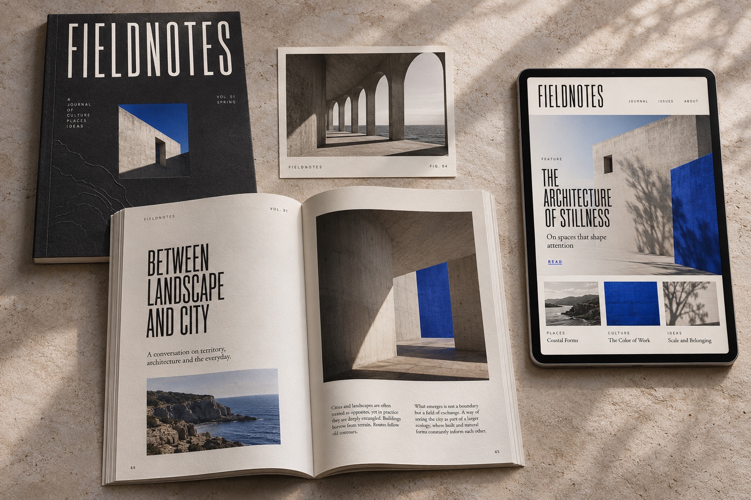
The work built a clearer presence across the site, the print, and the places the name shows up. It had to stay recognizable as the studio grew.
A strategic repositioning and identity refresh, made to sharpen the brand, clarify the message, and leave a digital presence people can recognize.

The work built a clearer presence across the site, the print, and the places the name shows up. It had to stay recognizable as the studio grew.
The old identity was inconsistent, and it had no single point of view. The job was a sharper system that could stand next to louder brands.
Skills
Sample groups. Edit the names and the lines so they match the work you actually do.
A picture, a crop, and the reason it exists.
Type, color, and rules a team can keep using.
A page that still feels like the printed work.
Experience
Sample roles. Replace the titles, the dates, and what you were responsible for.
2020 to present
Identity, art direction, and the site that has to carry both. Sample role.
2016 to 2020
Replace this with a real studio and the work you can show.
Open
A study with a clear audience and enough time to finish it.
Process, decisions, and the thinking behind the work. Sample notes stay drafts until you publish them.
Notes
A first draft is allowed to wander. The published one should know exactly where it is going, and why.
Product

Three changes customers asked for, the one we decided not to build, and what we learned from both.

Training

The session that looks easy from the doorway is usually the one that was earned over months.